Family Carers Ireland
"Most of a brand is made by people who aren't designers."
The challenge
Family Carers Ireland is the national charity for family and young carers, supporting more than 500,000 people across the country who care for someone with a disability, chronic illness, mental health difficulty, addiction or age-related condition.
Since changing its name from the Carers Association in 2016, it had built real recognition, so the logo, tagline and primary blue were staying. The work was everything around them. The brand had grown over time, and the system behind it needed to catch up with the organisation. It also had to work for an audience running from carers with little time and varying literacy to government ministers and corporate partners. And it had to be simple enough for staff with very different levels of design confidence to use every day.
The thinking
We ran two pieces of work side by side: workshops with teams across the organisation, from senior leadership to Home Care Services and Carer Supports, and a full audit of the brand in print, digital, social and organisation documents. Both reached the same conclusion independently. People trusted the brand. What it needed was a simpler system.
A template that needs design knowledge gets ignored, so simplicity drove our design decisions. Quicksand became the single lead typeface. It's warm, easy to read and free to download, so licensing stopped being a reason to go off-brand. Colour was rebuilt around one rule: dark blue and dark green as backgrounds, with the brighter logo colours in support. Every layout follows the same order (what, why, how), so a carer reading a social post and a minister reading a report find the point in the same place.
Accessibility was built in from the start. Contrast testing decided which colours could carry text, typography rules keep everything legible, and icons follow one simple style to cut down on reading.
The work
We delivered the brand refresh, including:
Brand: new design guidelines, with colour and type rules built for accessibility, a pattern drawn from the heart in the logo and a consistent photography and icon style
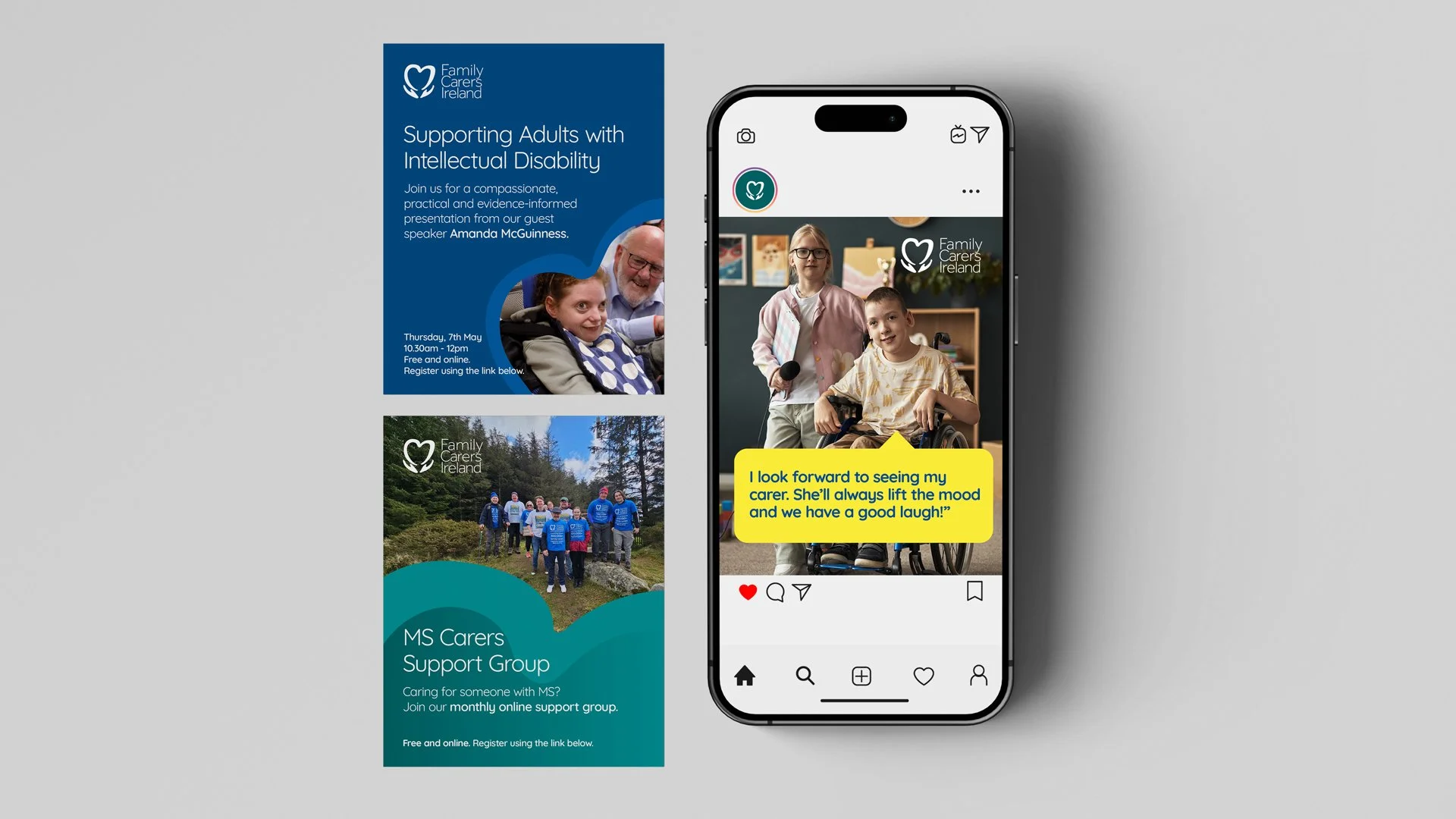
Templates: letterhead, email signatures, Word and PowerPoint, leaflets, A4 trifold booklets and social media posts
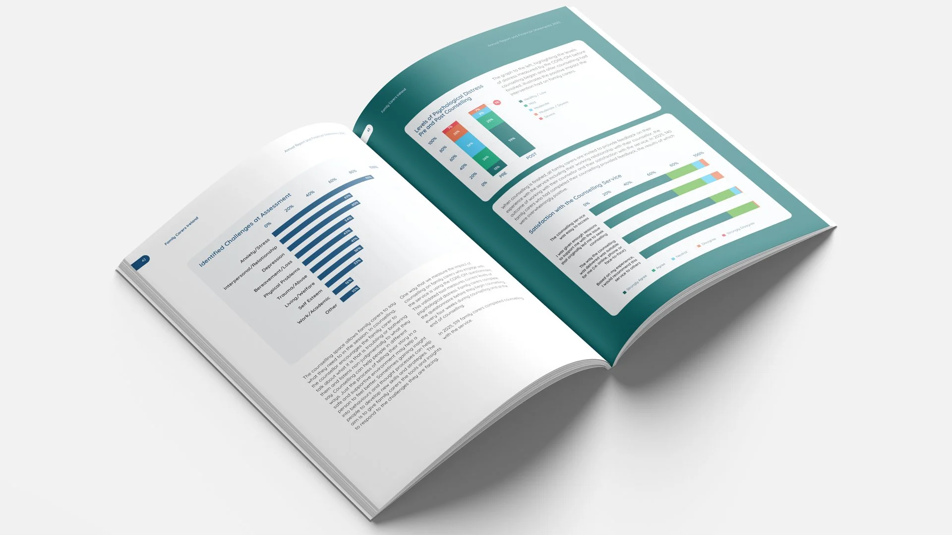
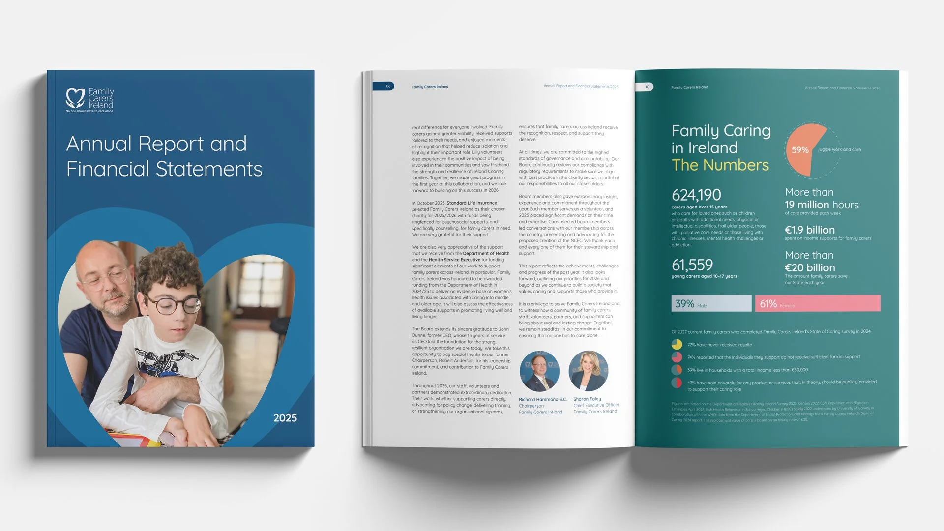
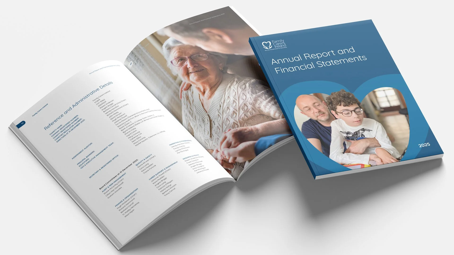
Publications: the 2025 annual report, produced as a tagged, accessible PDF
Campaigns: Family Carers Week social assets